Covers that sound like the music.
Cover art and label identity for production music.
01 / 05
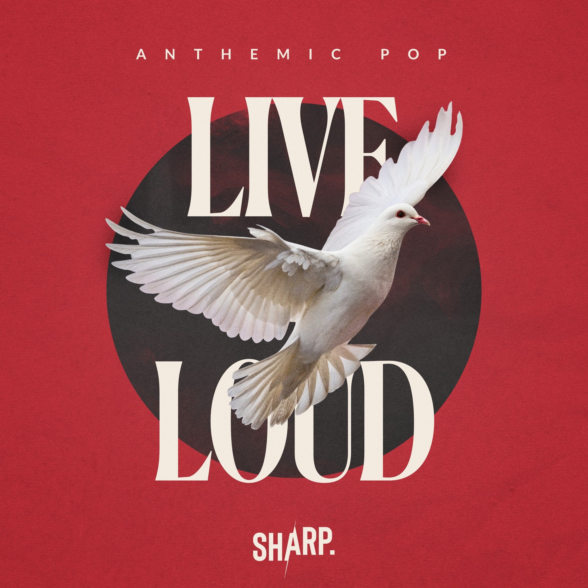
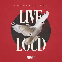
Live Loud
Anthemic pop. One symbol, one circle, nothing else in the frame.
At thumbnail size, on its shelf


02 / 05
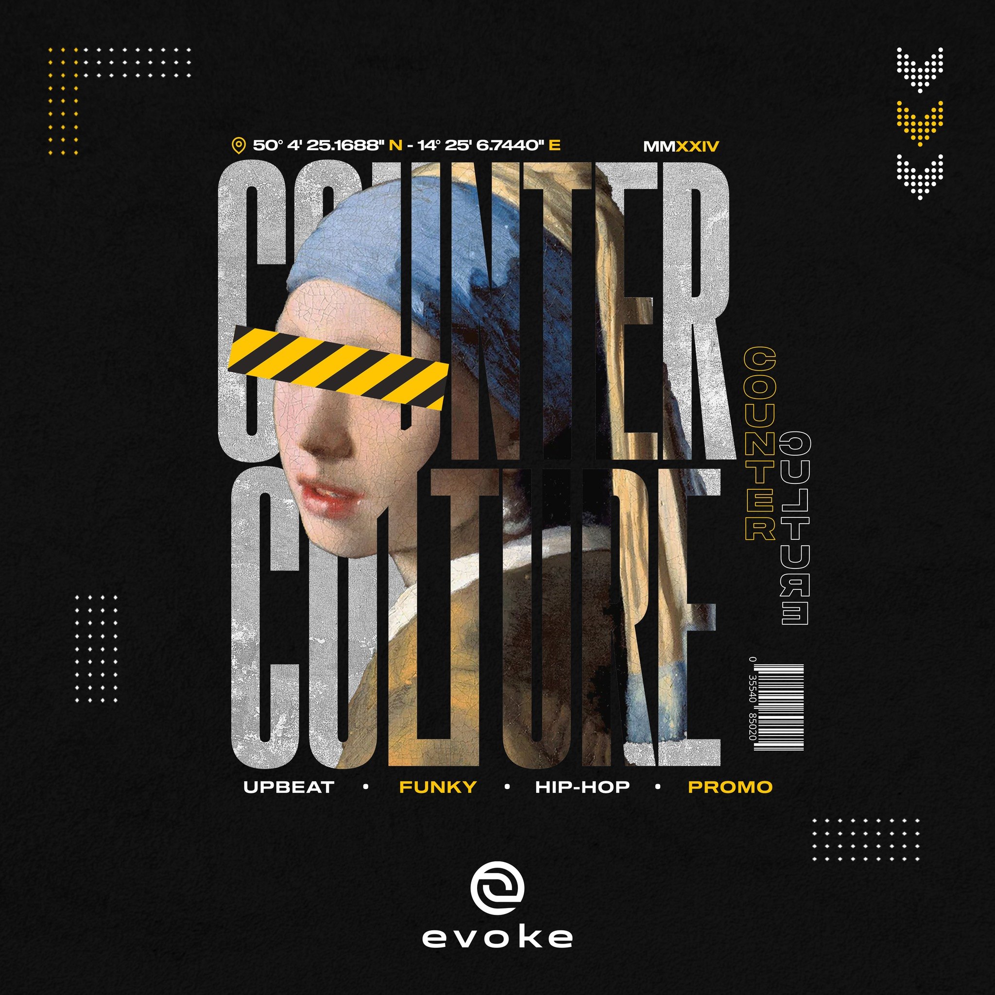
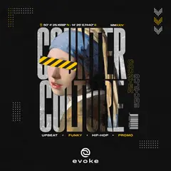
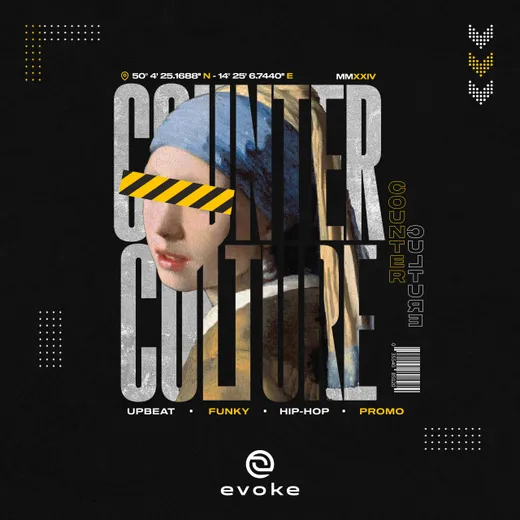
Counter Culture
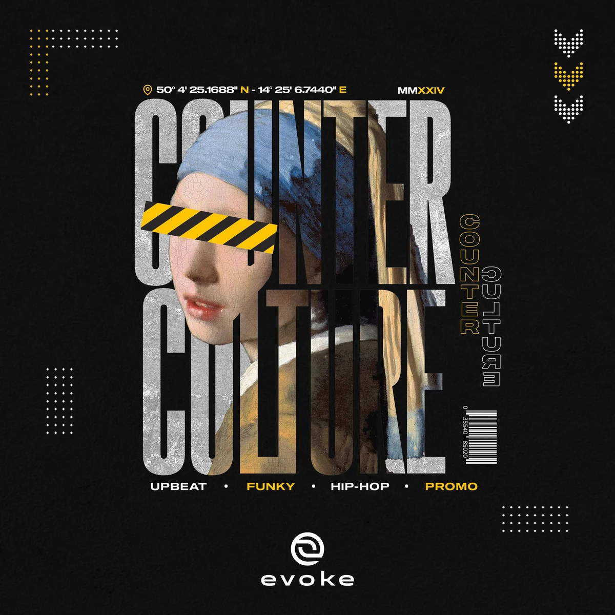
Upbeat hip-hop, in a catalogue that otherwise runs clean. A museum portrait flyposted over, with the title cut straight through the face.
At thumbnail size, on its shelf



03 / 05
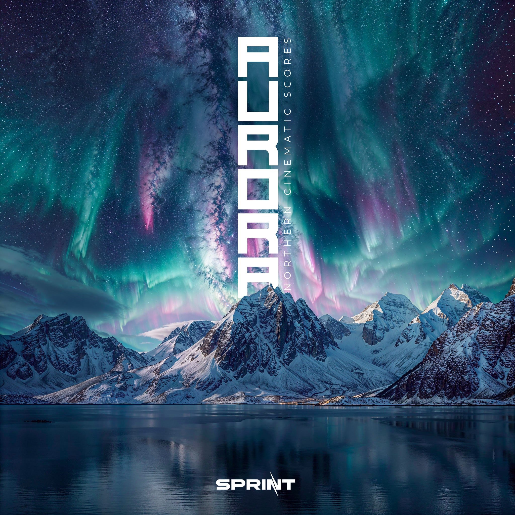
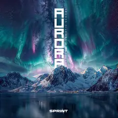
Aurora
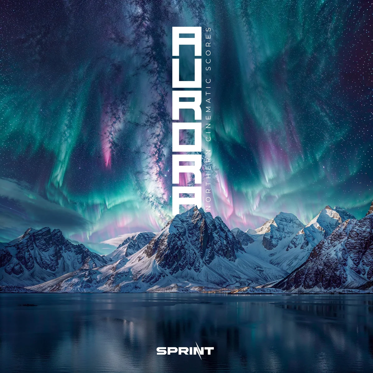
Northern cinematic scores. The title stands upright in the sky, so the type and the aurora rise together.
At thumbnail size, on its shelf
04 / 05
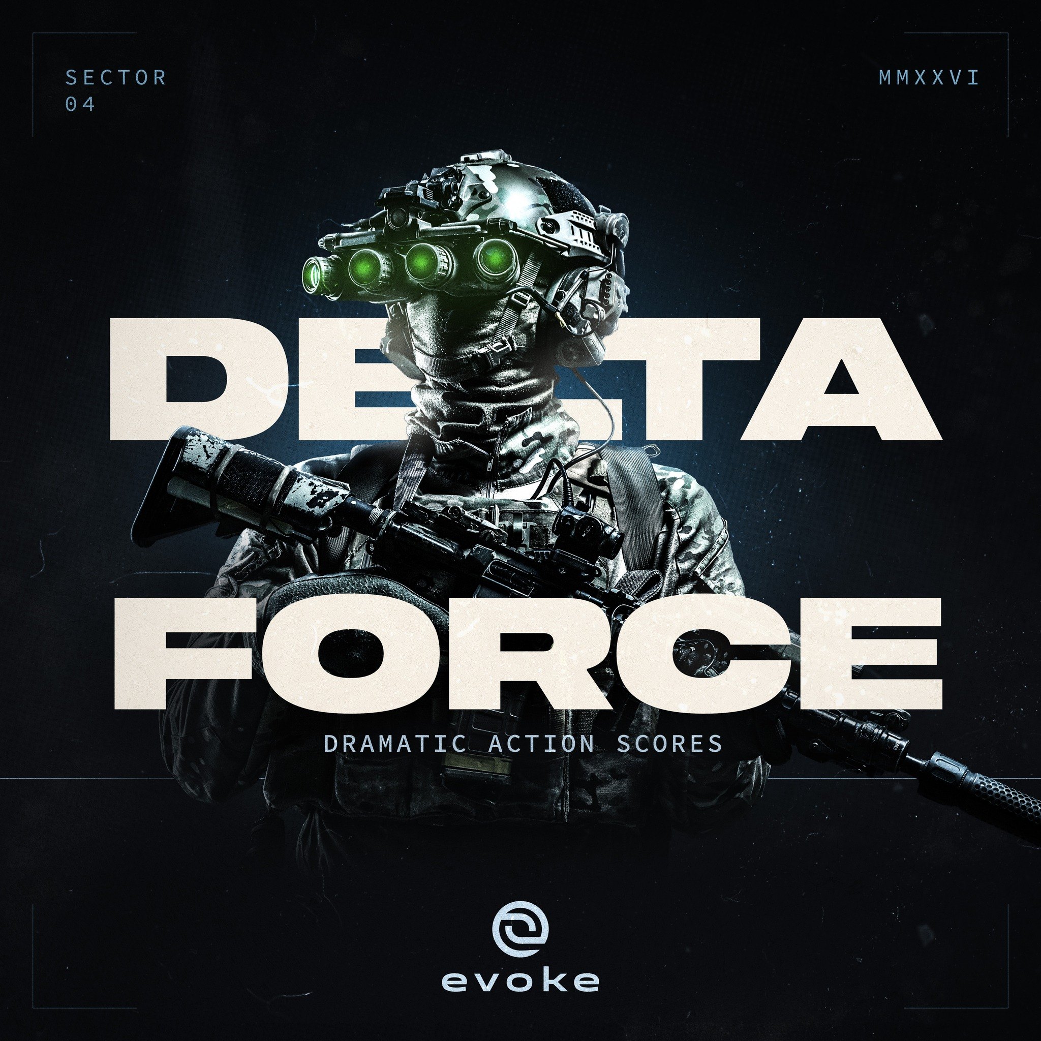
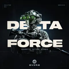
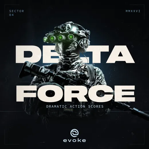
Delta Force
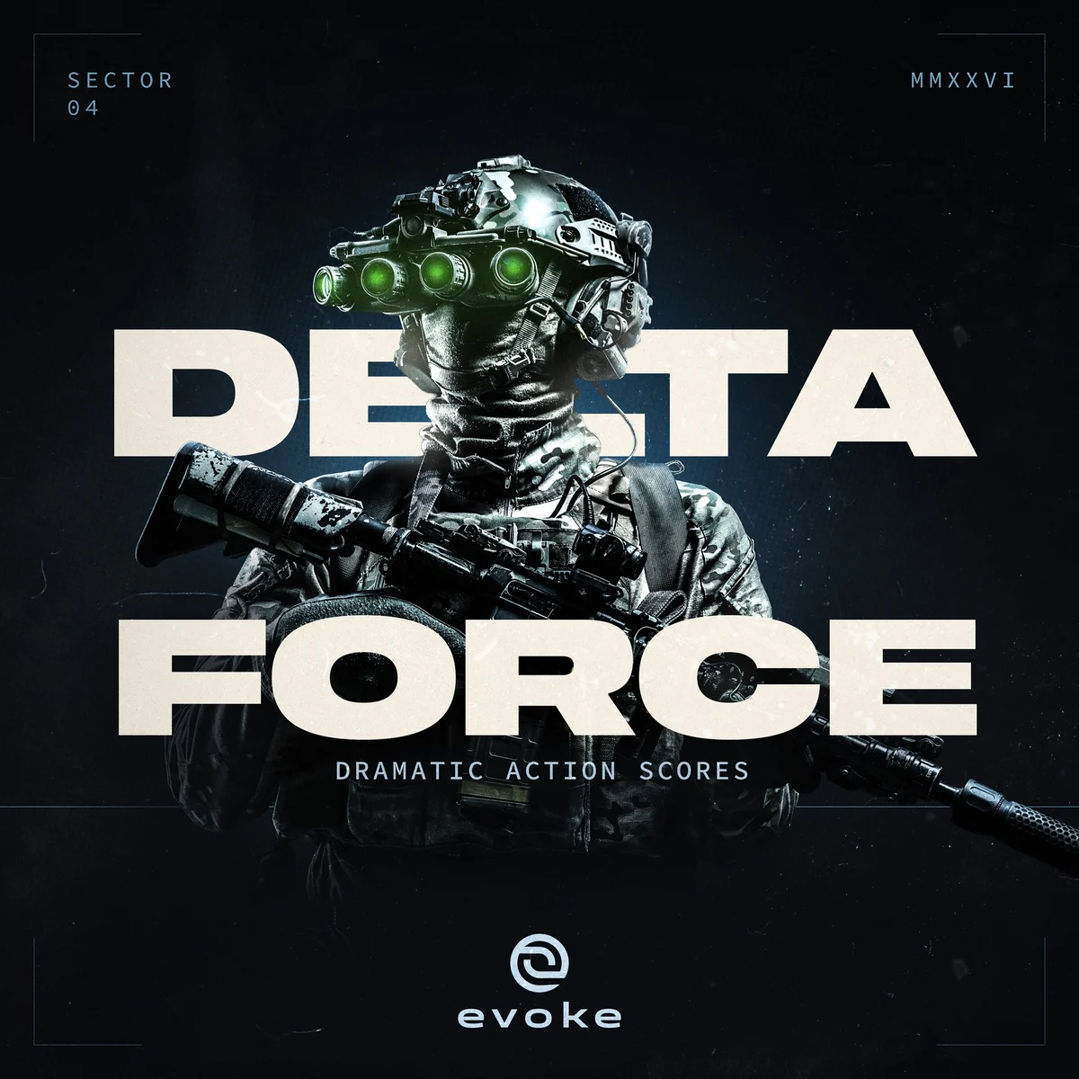
Dramatic action scores, in a catalogue where every cover has to hold up at promo size. The wordmark runs the full width and the figure breaks through it, so the title carries the weight instead of sitting on top of it.
At thumbnail size, on its shelf



05 / 05
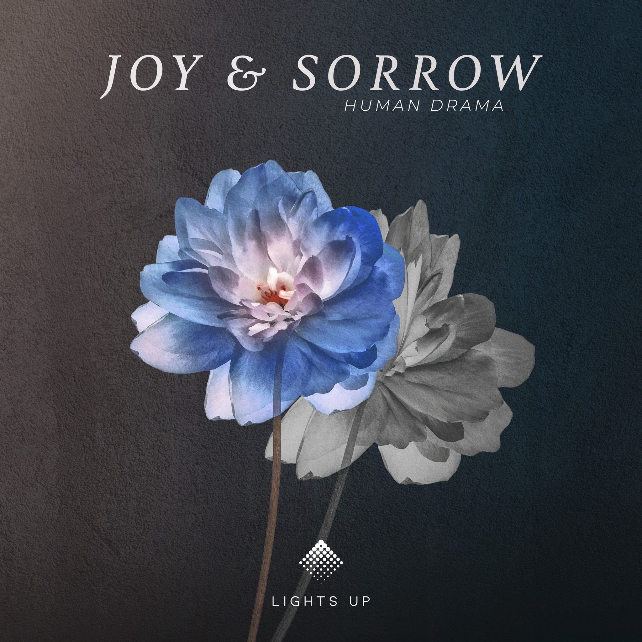
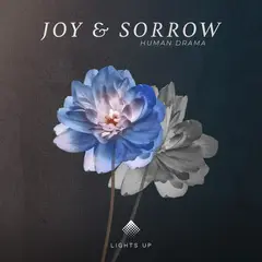
Joy & Sorrow
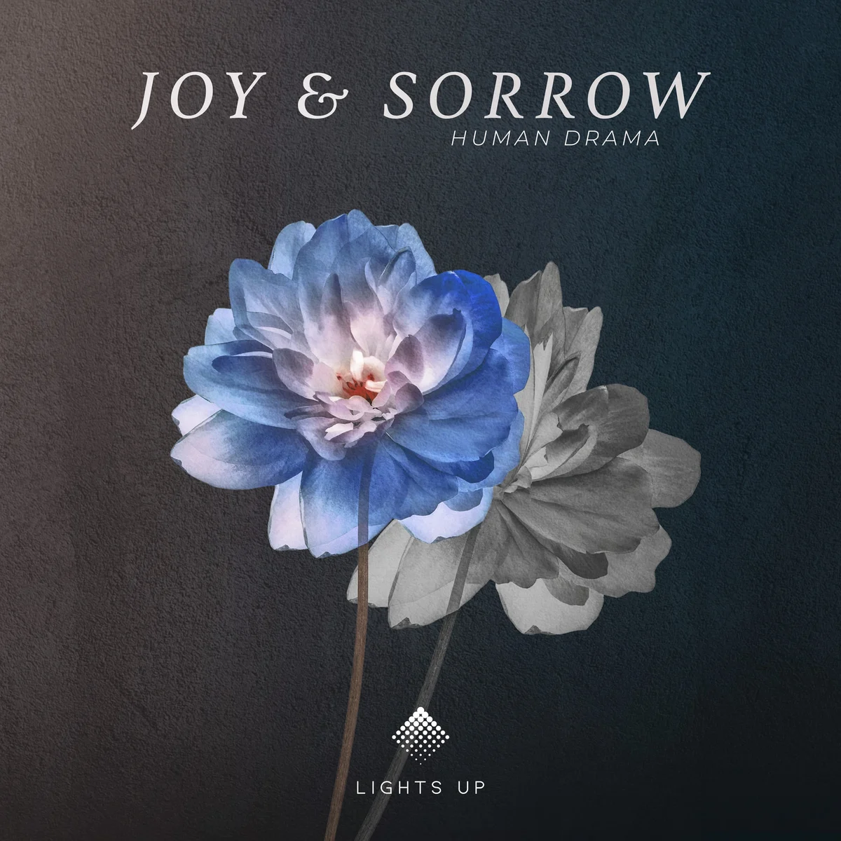
Human drama, told with a single flower split between colour and monochrome. The whole brief in one object.
At thumbnail size, on its shelf


Cover art from inside the music industry
Covers that soundlike the music.
8 years of experience · 350+ covers · 20+ catalogues
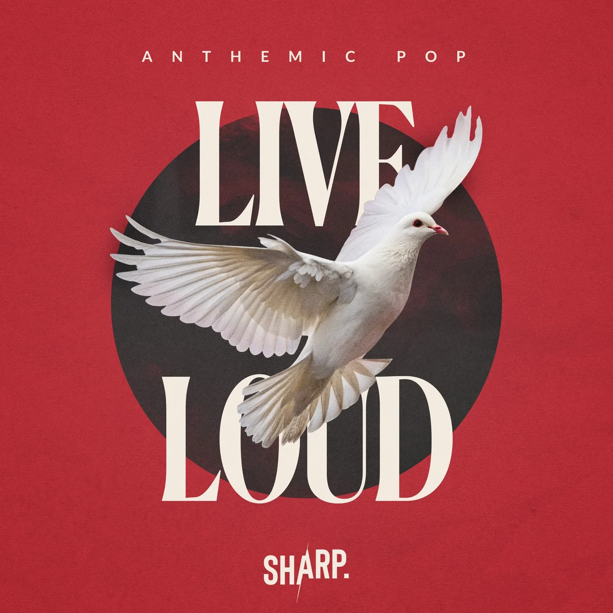
Live Loud
Anthemic pop. One symbol, one circle, nothing else in the frame.
At thumbnail size, on its shelf
Counter Culture
Upbeat hip-hop, in a catalogue that otherwise runs clean. A museum portrait flyposted over, with the title cut straight through the face.
At thumbnail size, on its shelf
Aurora
Northern cinematic scores. The title stands upright in the sky, so the type and the aurora rise together.
At thumbnail size, on its shelf
Delta Force
Dramatic action scores, in a catalogue where every cover has to hold up at promo size. The wordmark runs the full width and the figure breaks through it, so the title carries the weight instead of sitting on top of it.
At thumbnail size, on its shelf
Joy & Sorrow
Human drama, told with a single flower split between colour and monochrome. The whole brief in one object.
At thumbnail size, on its shelf

Who designs these
I'm Daniel Markes. I work in the music industry, and I design its covers.
Music is my background and my day job, so I know what a release has to say before the brief arrives. My work is turning that into design: covers that feel like the music instead of just decorating it.
More about meIn their words

Daniel was a safe pair of hands for us. He kept to our brand and our deadlines, and he kept bringing creative ideas of his own. We would gladly work with him again.
Case I · Sprint
Label identity redesign
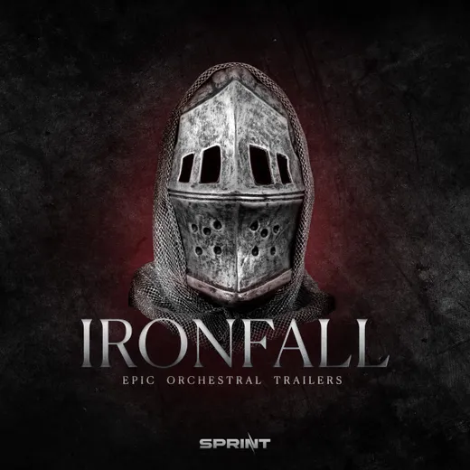
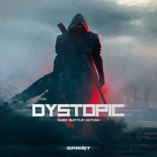
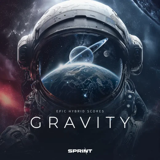
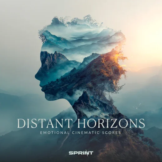
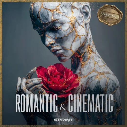
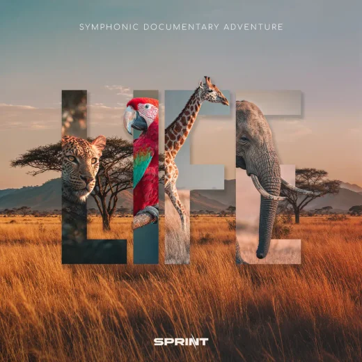
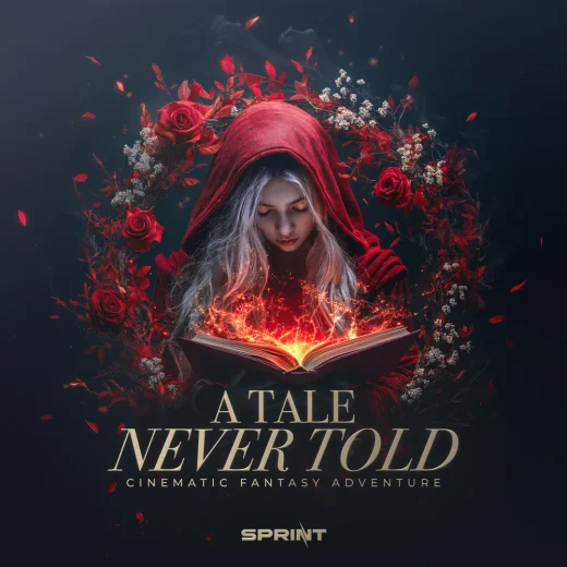
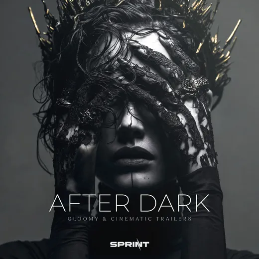
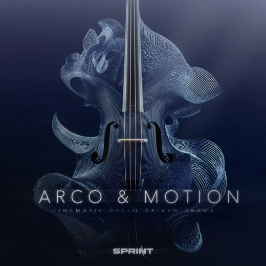
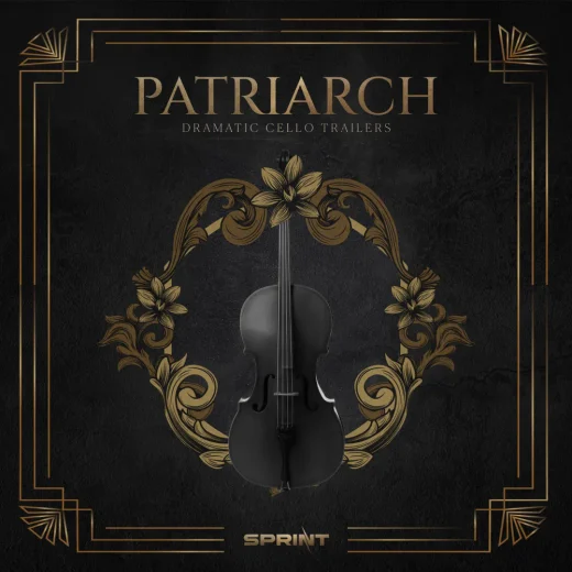
For a cinematic trailer label: a new logo and one cover system in 2023, carried across 50+ releases.
Before · 2019

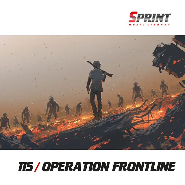
1template for every release: the logo, a stock photo in a strip, the number and the title.
After · 2023

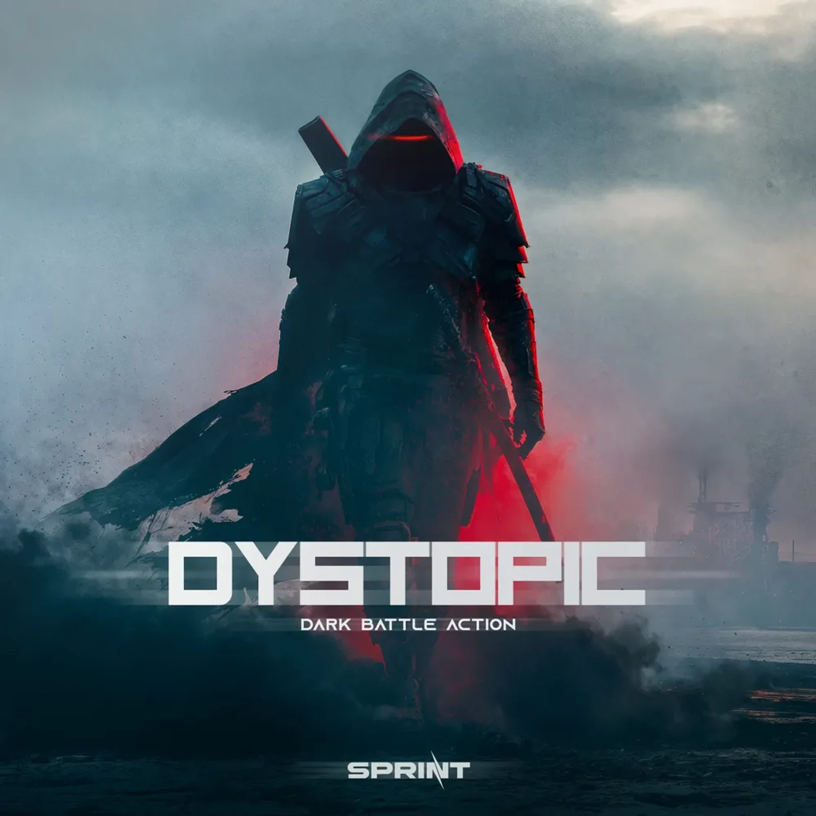
50+releases, each with its own cover inside one system. Pick any cover to see it full size.
I designed every cover in this run, and the identity behind them.
Case II · Cloud Atlas
Catalogue redesign
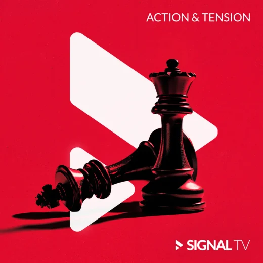
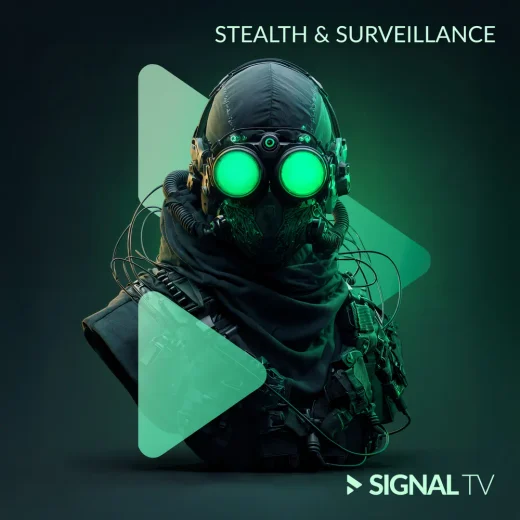
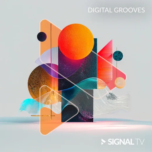
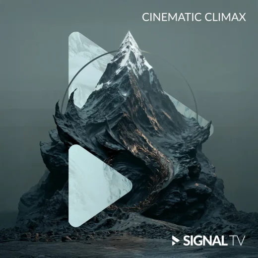
For a Norwegian production music catalogue: all 16 covers redesigned as one system, so the whole catalogue reads as one shelf.
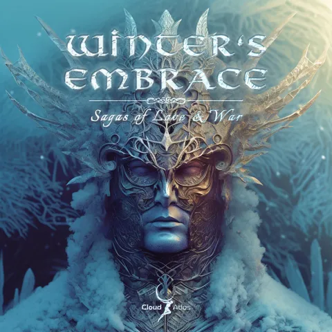


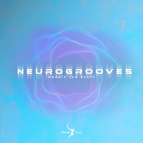

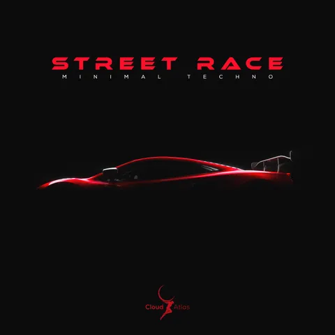
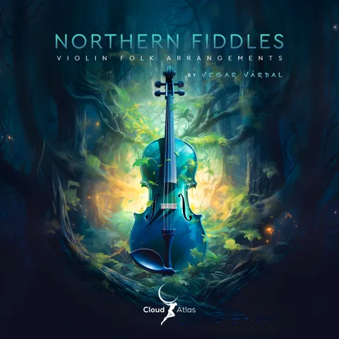
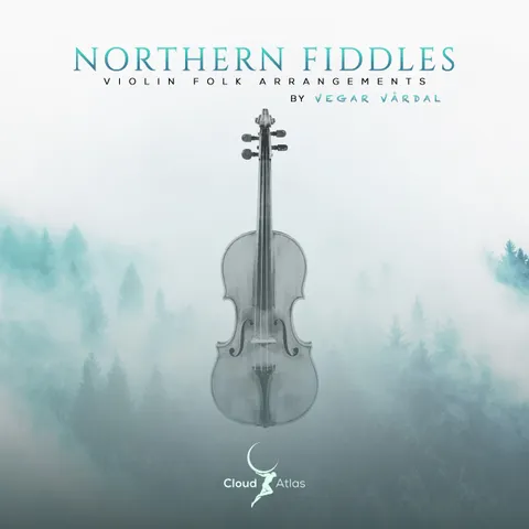
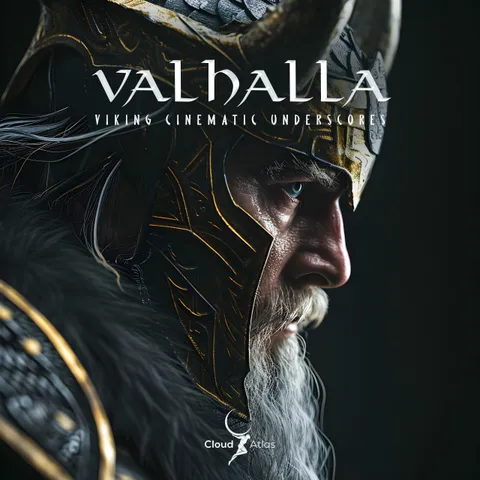
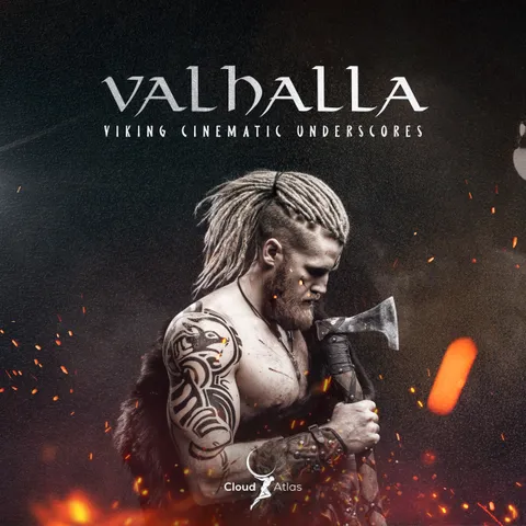
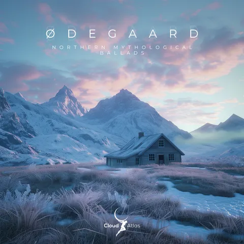
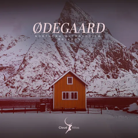

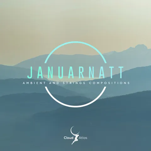
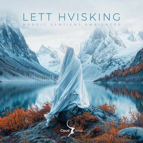
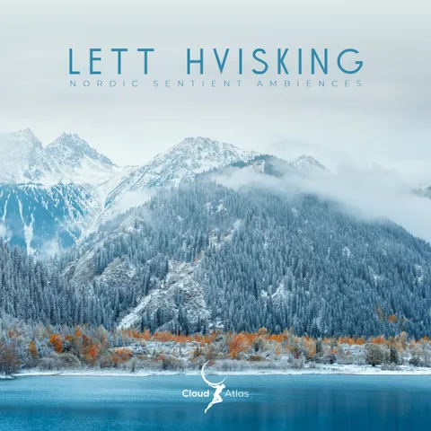
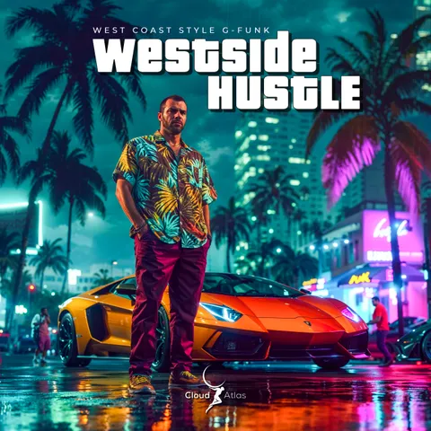
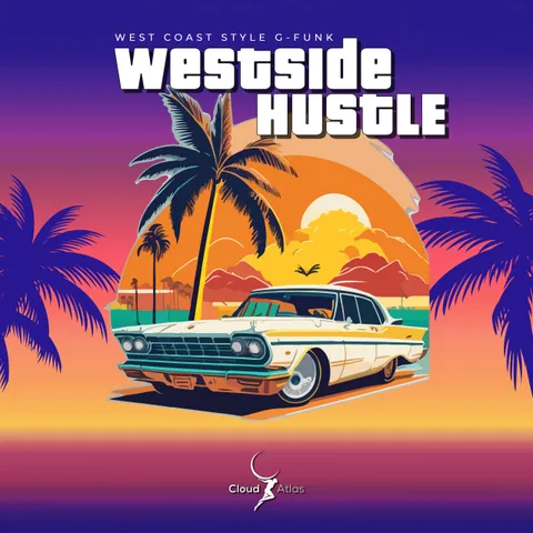

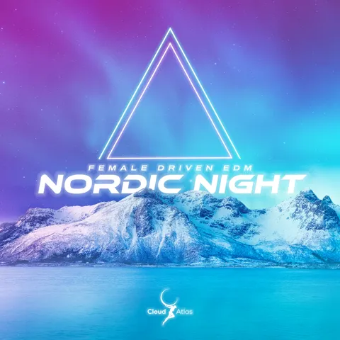
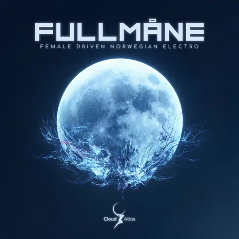
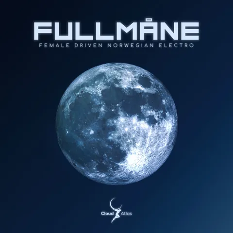
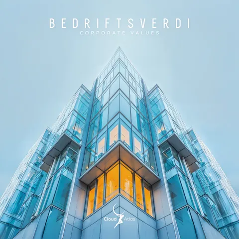
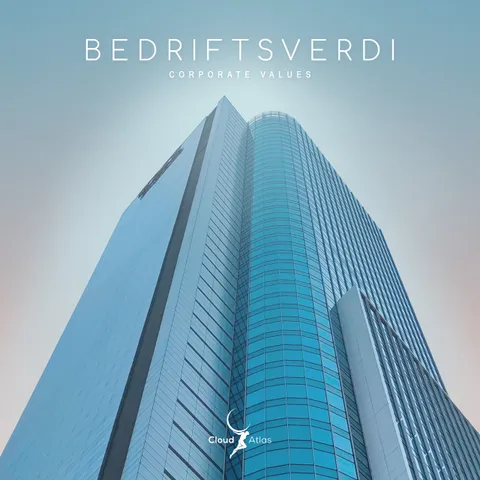
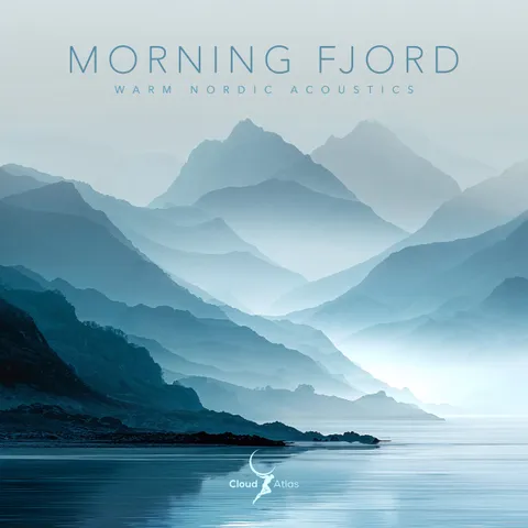
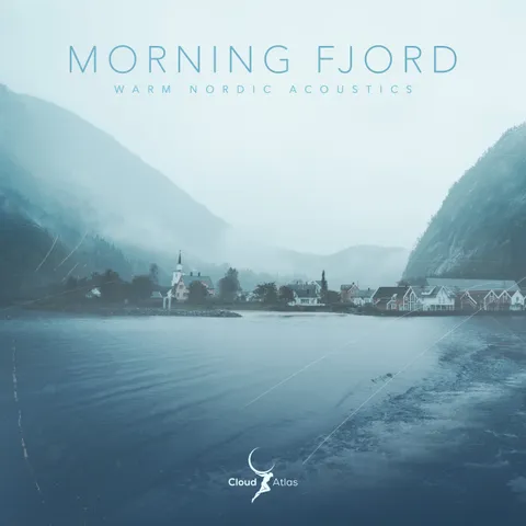
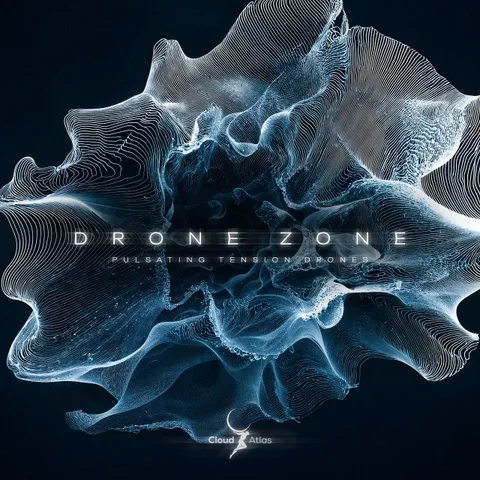

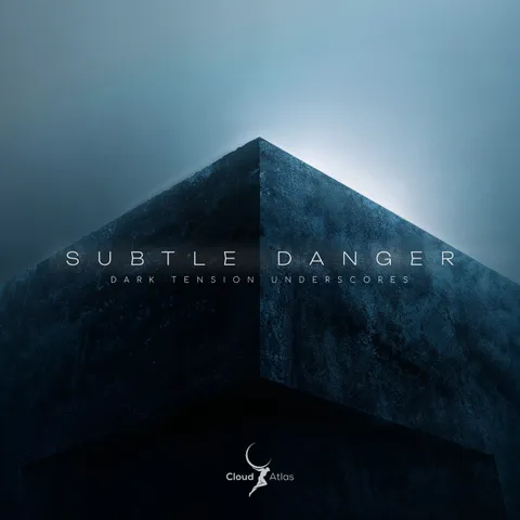
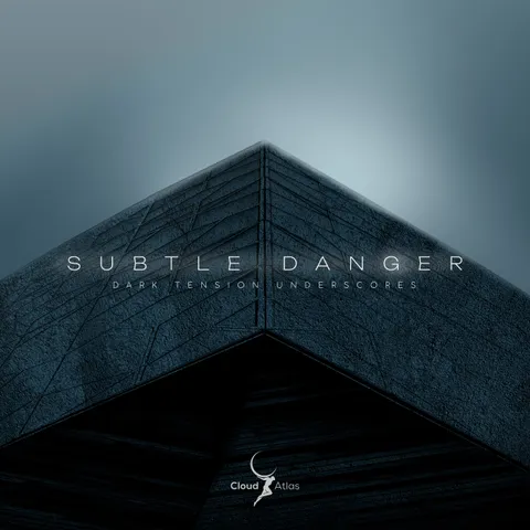


Same releases, one consistent look. Each cover stands on its own and still belongs to the set.
I designed every cover in this catalogue.
Series
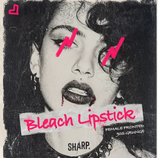
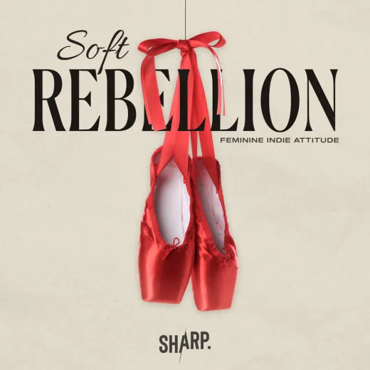
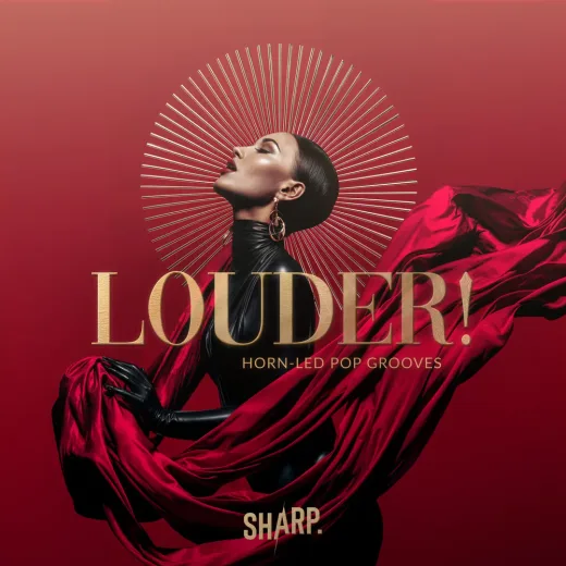
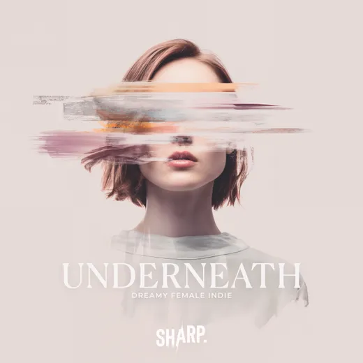
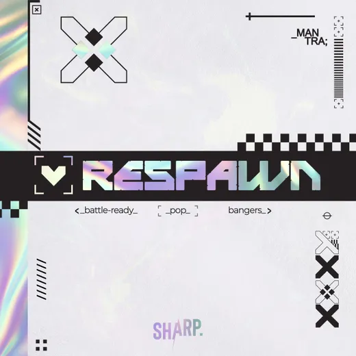
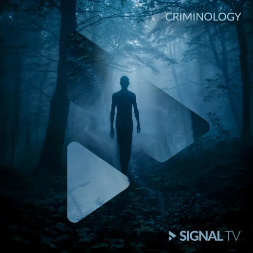
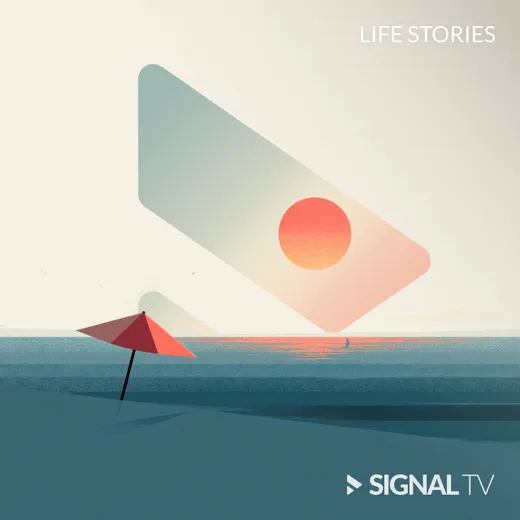
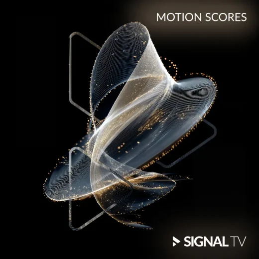
A catalogue is read as a shelf, not as singles.
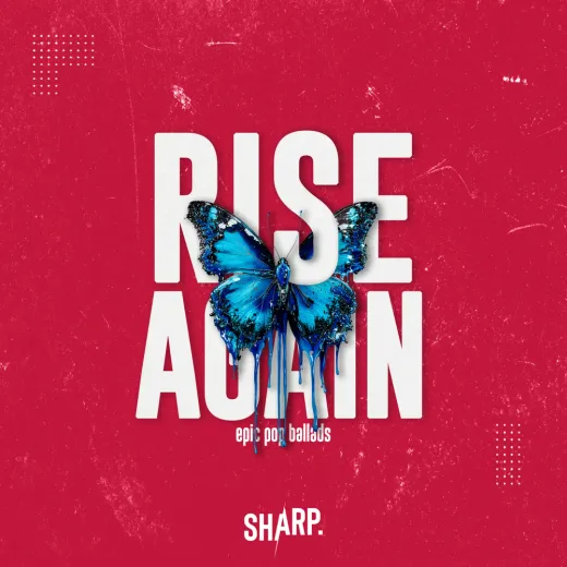
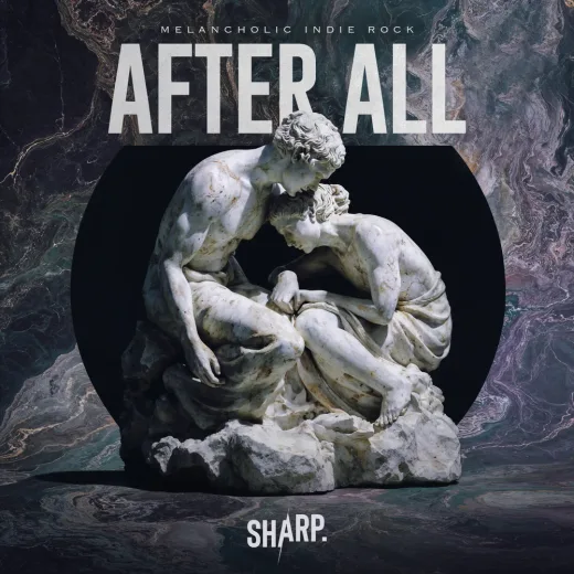
Four catalogues, ten covers each.
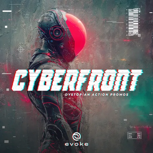
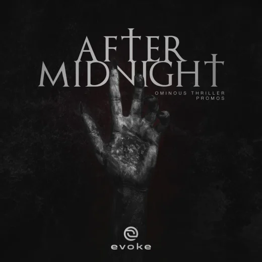
Chart and radio pop


Music for TV and advertising



Cinematic trailer music
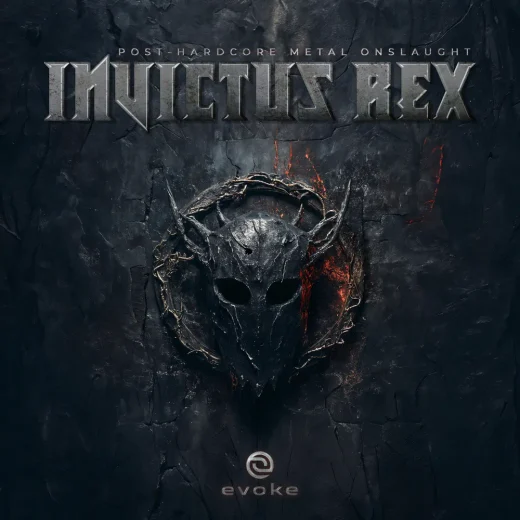
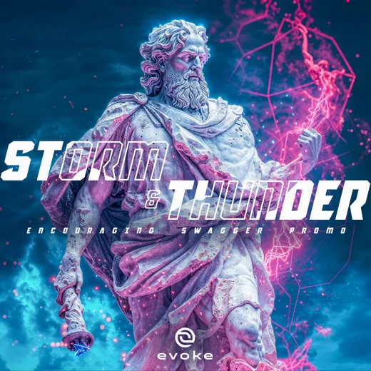
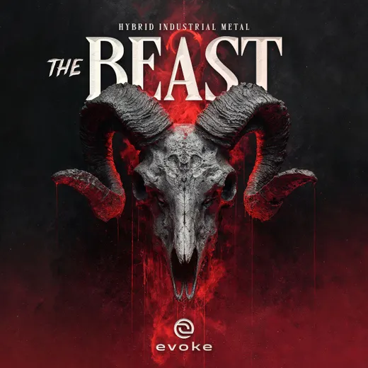
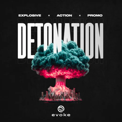
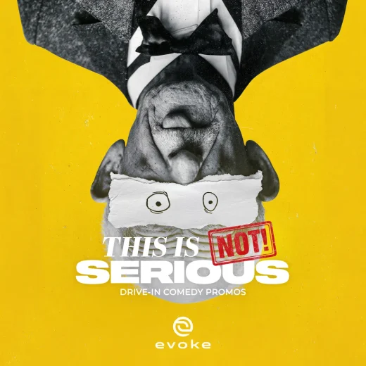
Promo and trailer music

Your release
Tell me about your release.
I read every message and reply within two working days.